Multiverse is a platform that enables non-graduates to find apprenticeship opportunities in companies.
Tools
Figma, Miro
Platforms
Web app
The Problem
Candidates are unclear on their profile completion status, leading to 9% “exit responses” and uncompleted users. The Admissions team spends significant time reminding candidates to complete their profiles.
Hypothesis
We believe showing candidates their progress and what to expect will reduce incomplete profiles to 10%. We believe that showing candidates what next after completing their profile will act as a reward and encourage profile completion.
Research
User Interview
I interviewed the users and observed their pain points through the user interview. I also interviewed admissions and customer support teams to understand the major pain points using the platform and identify current issues and feedback from the users. I also reviewed the customer team to find out what were the most complaints they received regarding profile building and completion. I also took it a step further by analysing the “Hotjar” videos of users to see where they spend the most time and struggle the most.
Data
I reviewed tickets received by customer support and admission team. I established some of the most common questions users had using the platform which included:
Candidates do not understand the time it takes to complete their entire profile.
Candidates do not remember which section of their profile is completed.
Candidates do not know what to do to complete their profile.
There are no clear indicators of users going back to complete profile.
Some parts of the profile are not clear enough.
Candidates spend too much time filling in data and not enough time to learn skills.
For the admission team, the pain point was to get users to complete the same questions and upload the same files which took most users hours to complete their profiles. The admission team also have lost candidates to complete the profiles.
Comparable Solution
While looking at comparable solutions, we were able to identify some patterns and designs companies like Linkedin and The Dots use in helping guide their users to build their profile.
Potential solution
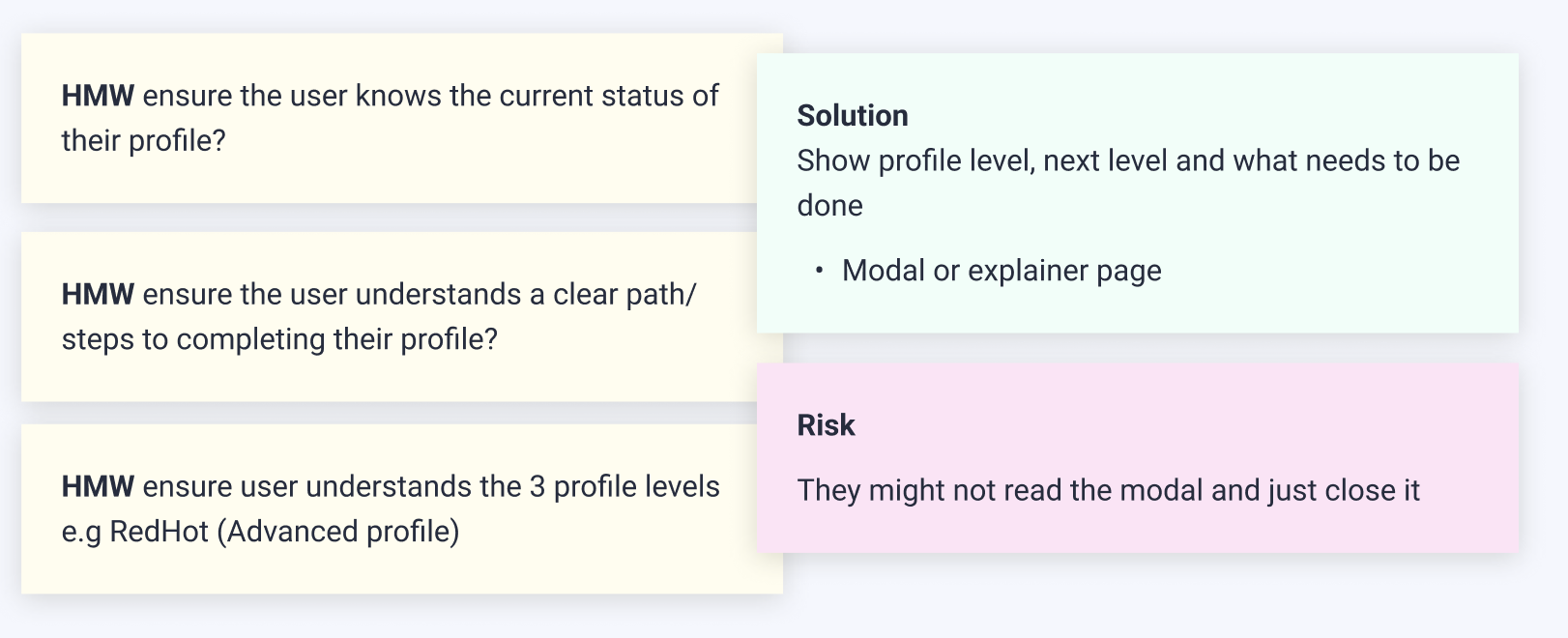
After doing some research and seeing what other comparable solutions are out there we knew we needed to figure out:
• HMW ensure the user understands their current status of their profile • HMW ensure the user understands a clear path/steps to completing their profile • HMW ensure user understands the % profile needs to be reached (advanced profile) • What and what not the modal and panels need to do.
Risks
They might not read the modal and change it
Solution
Show profile strenght, next step and what needs to be done to complete the profile:
• Modal or explainer page
Usability Test
The objective of this test is to ensure the user understands a clear path/steps to complete their profile. This is also to reduce time spent on average completing their profile.
Method and participants
I opted for unmoderated user testing session using usertesting.com, targeting participants aged between 18 and 25 years old.
Method Used
Prototype testing – We then used he feedback and iterated the design.
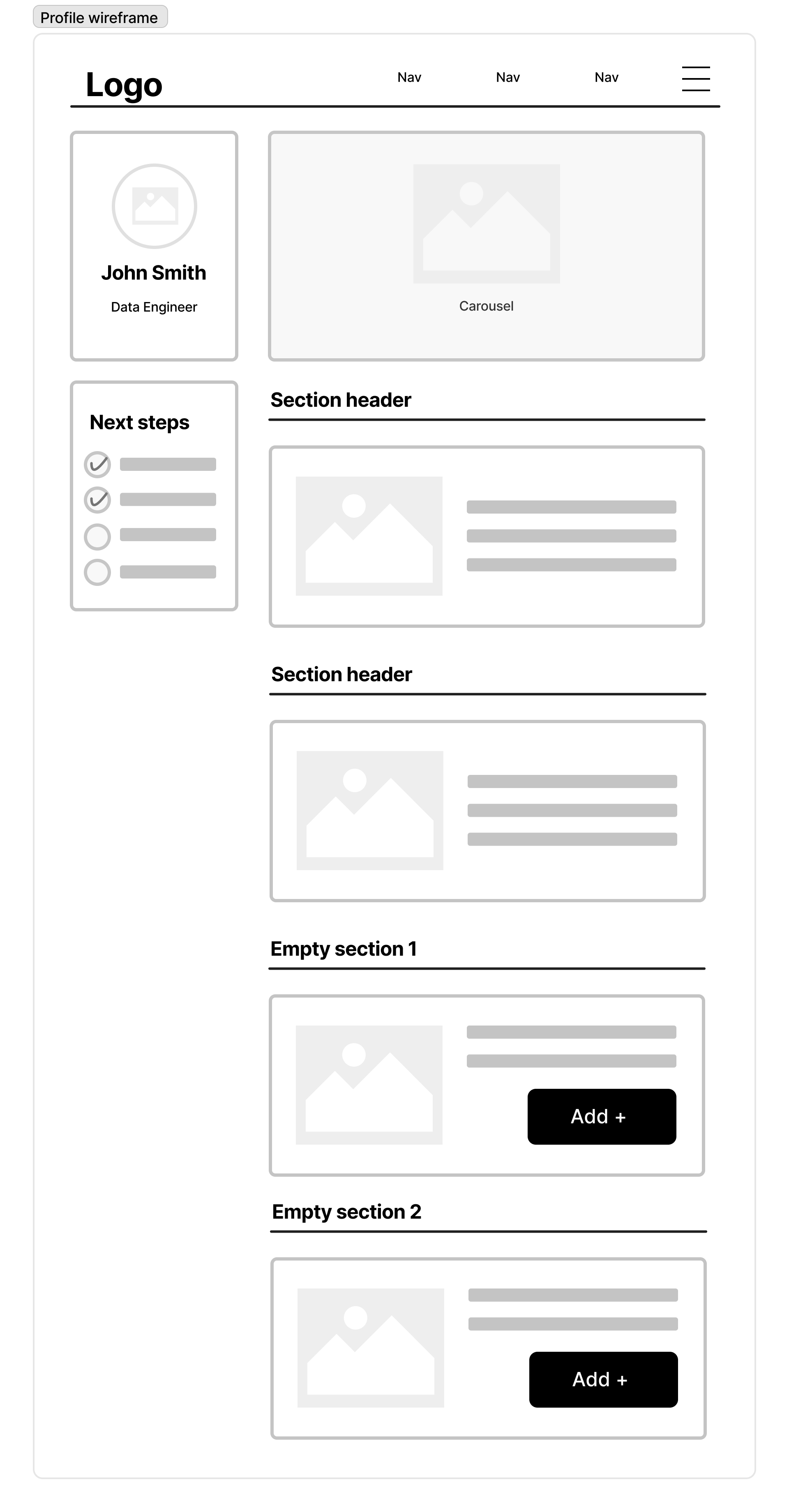
Wireframes
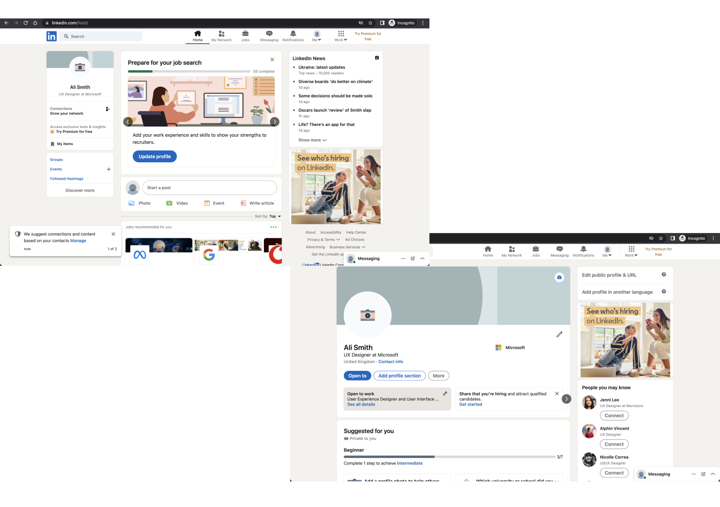
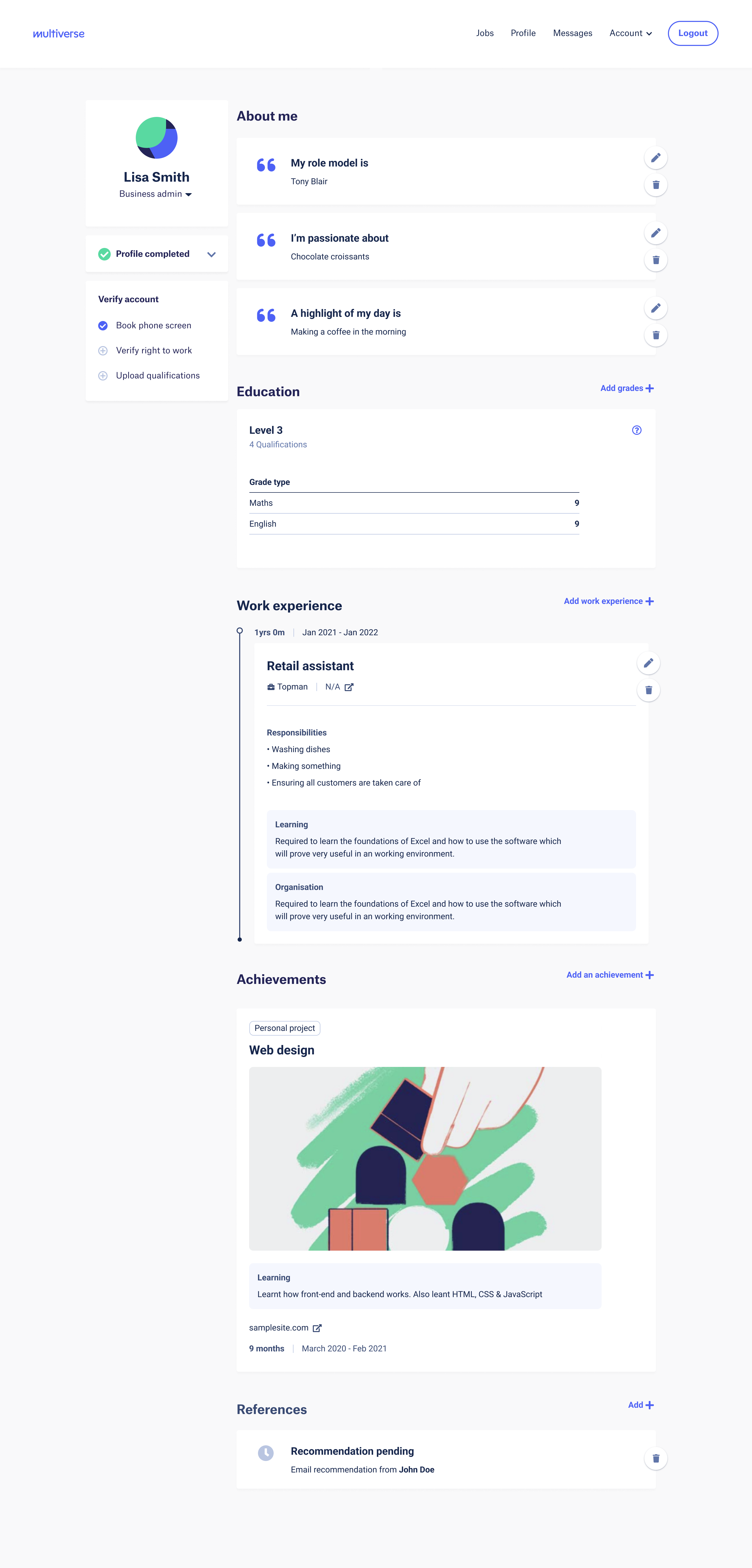
Current screen:
The screen below shows the current design after users sign up for the platform.
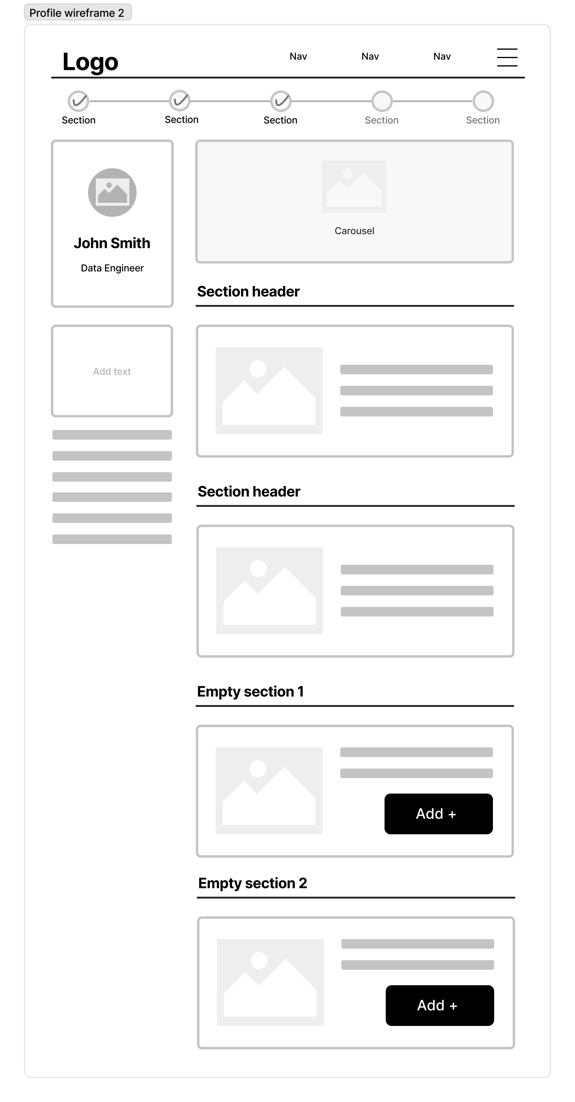
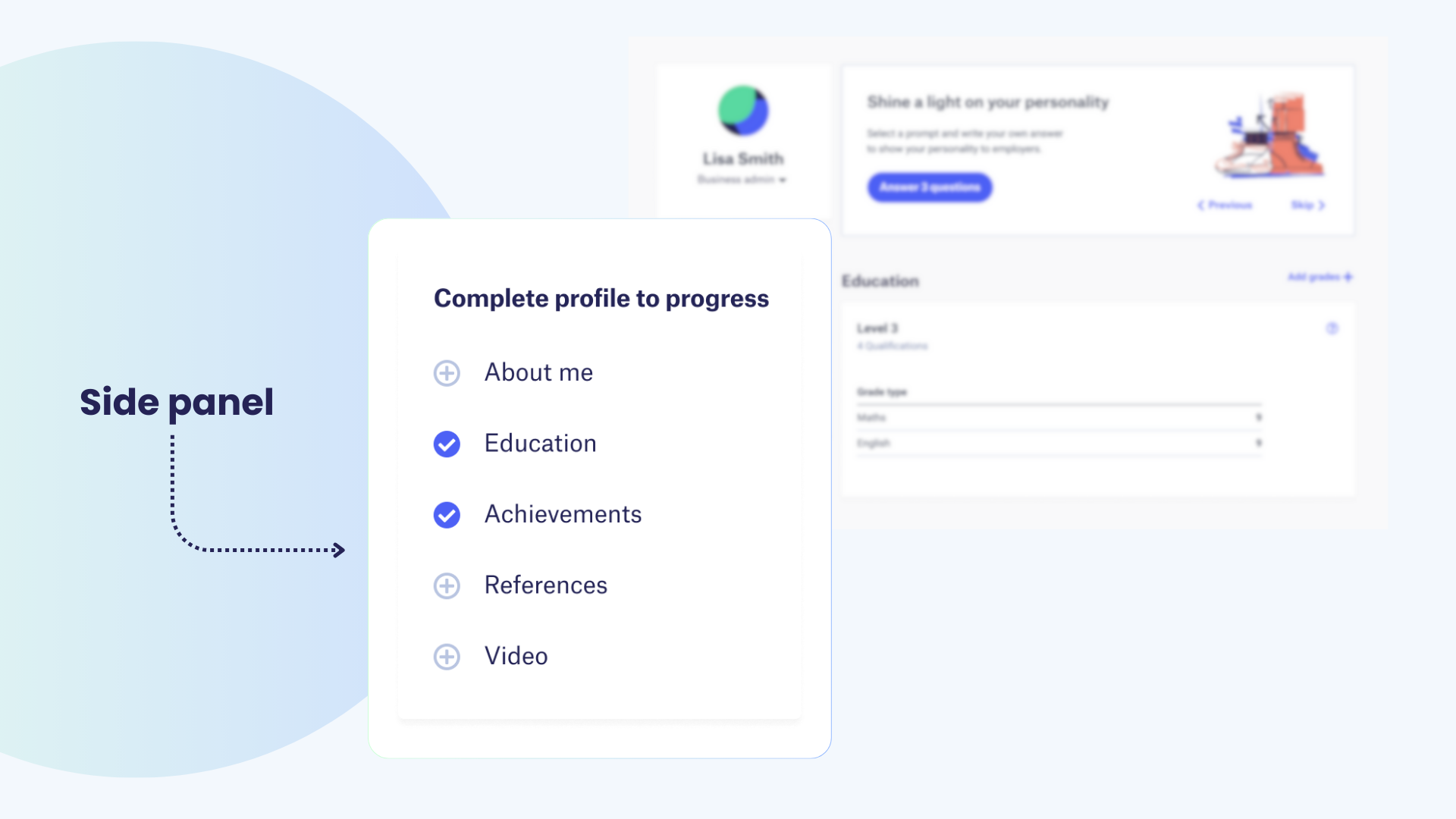
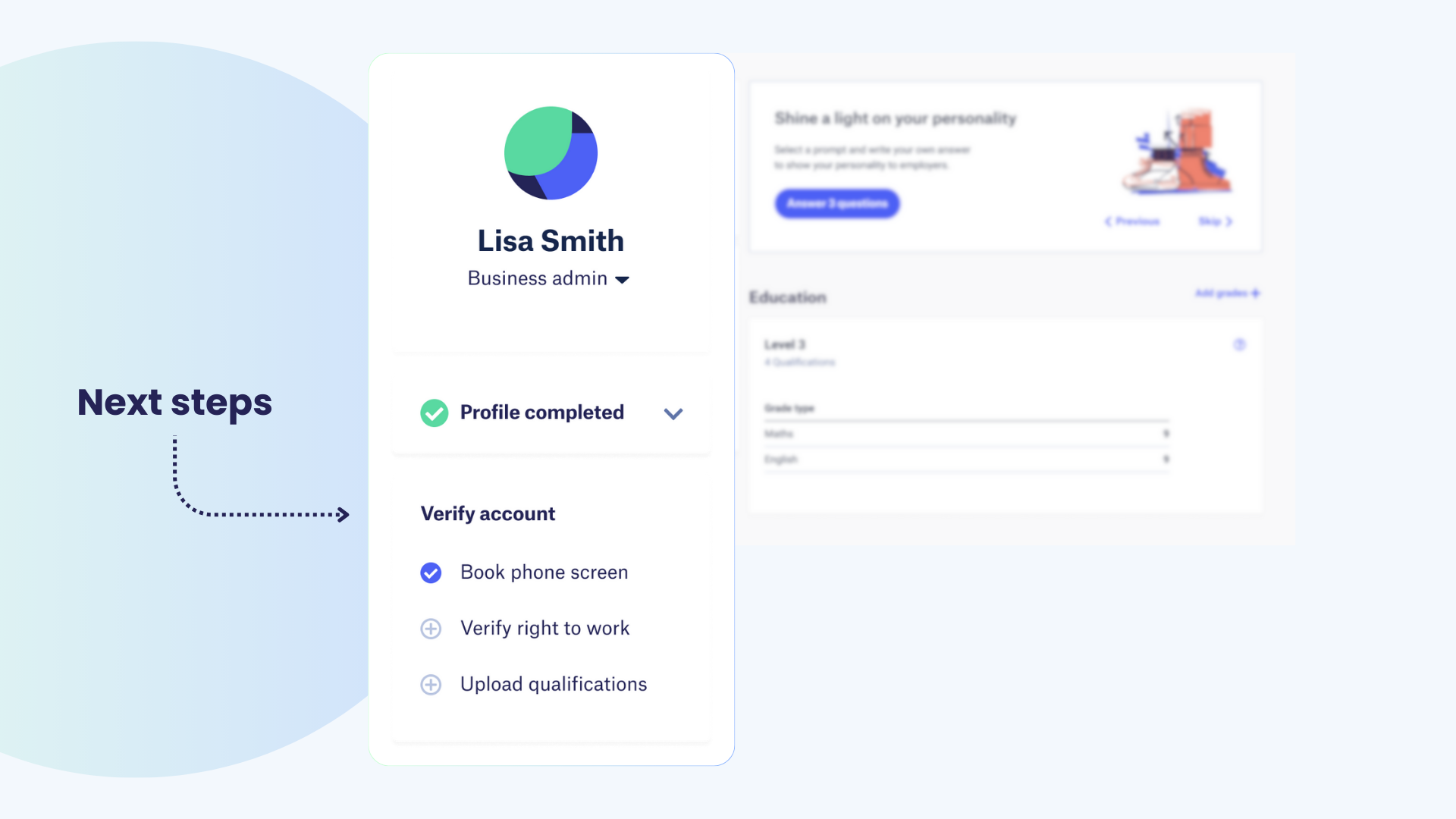
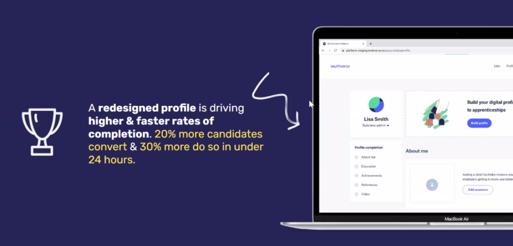
Final Design
Features
Full Page
Insights & Top Takeaway
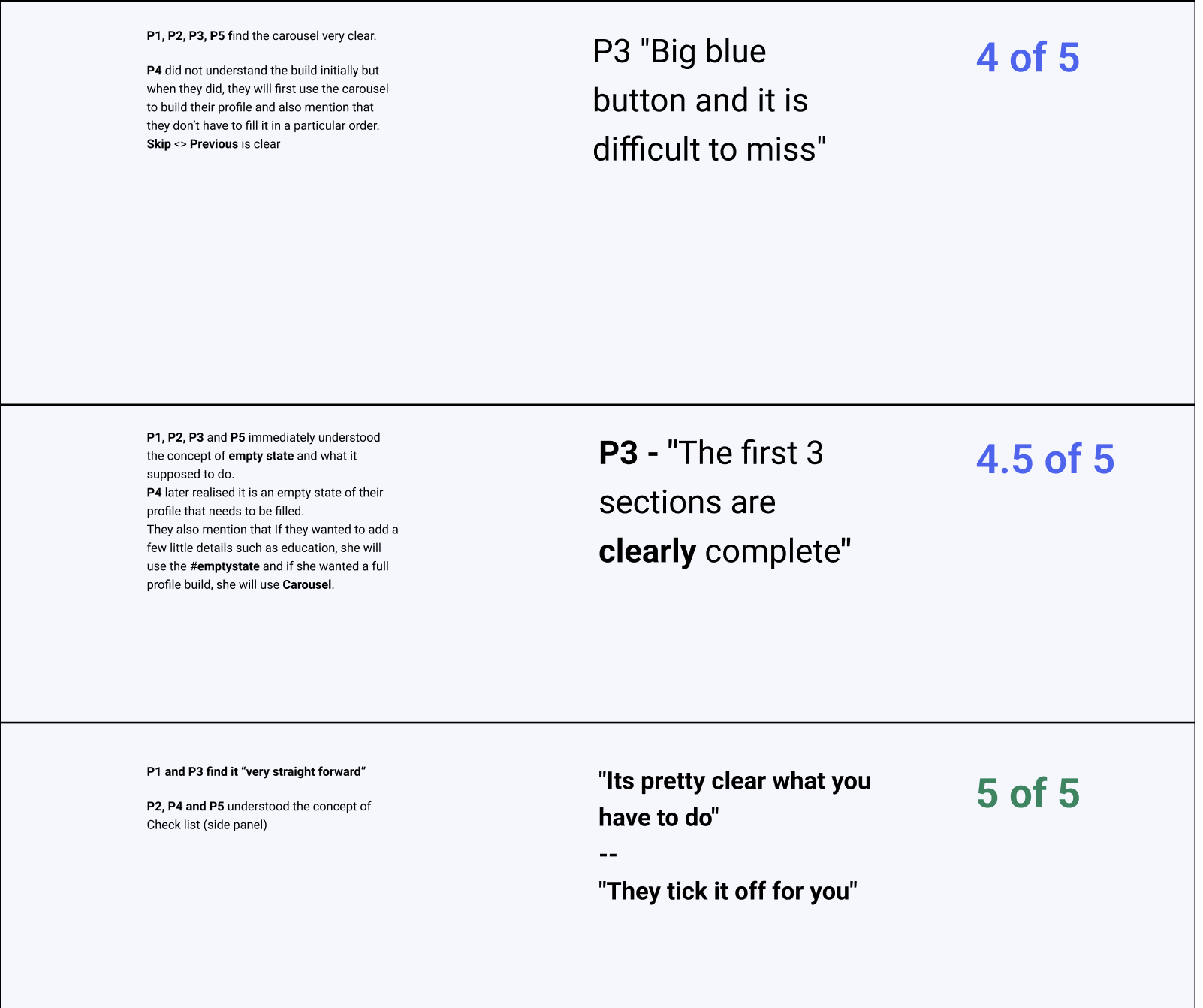
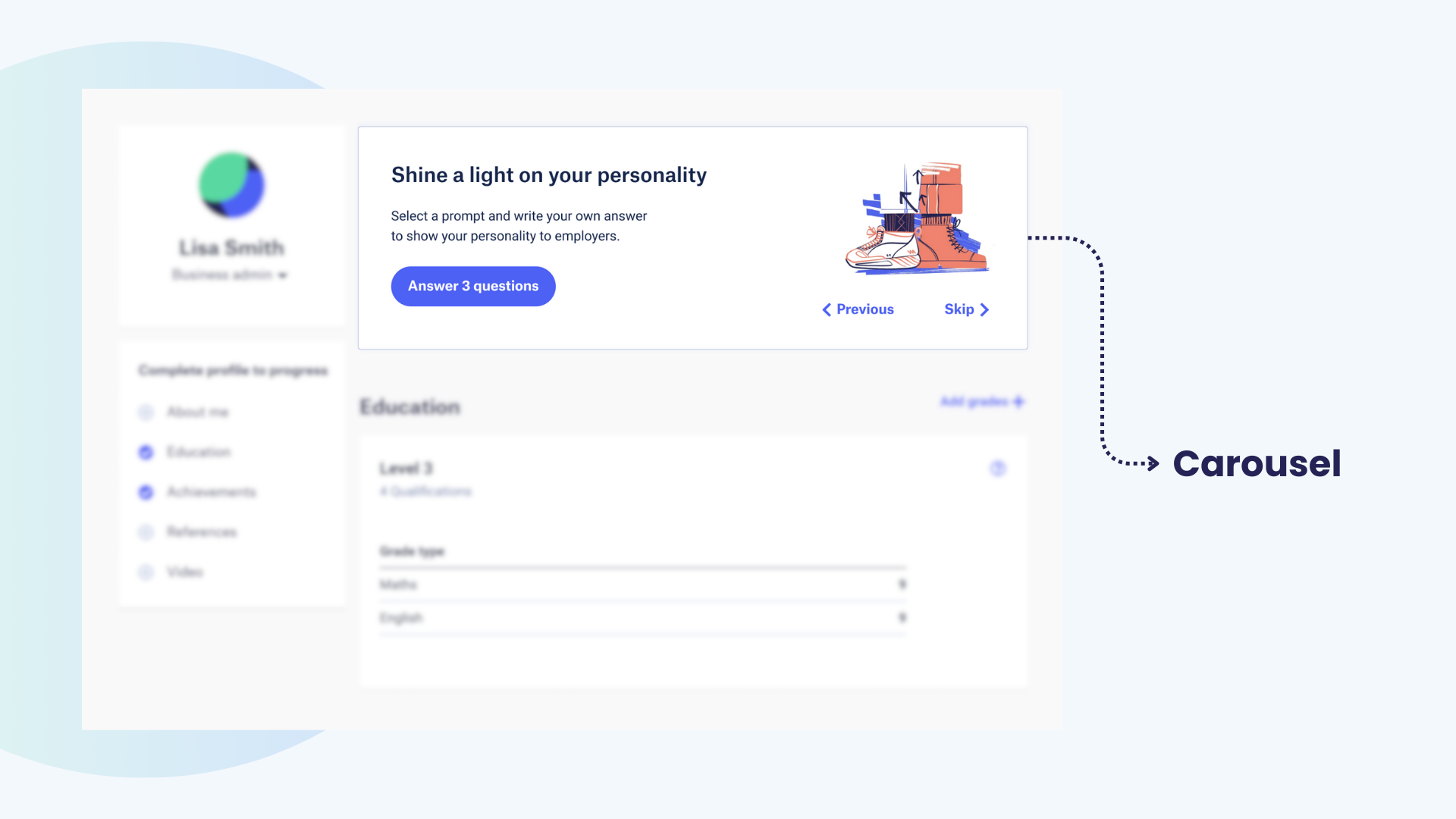
Carousel
4 of 5 understood the “Build profile” carousel immediately. “Quote: “The first big blue button is difficult to miss.”
Confirmation (modal)
Candidates understood what this modal represents Quote: “Don’t like the wording on it.” “Hopefully give more direction on what phone screen would represent.”
Overall, candidates find the sections quite clear and easy to understand their current state and what they need to do next.