Multiverse is a platform that enables non-graduates to find apprenticeship opportunities in companies
Multiverse
-
Tools
Figma -
Platforms
Web app
The Problem
Candidates are often slow to complete their profiles and are often confused about whether they have completed their profiles or still need to do more work. This leads to a significant amount of “soft rejections” due to incomplete profiles (about 8%) and this leads to a higher churn rate.
The admission team also spend a lot of time chasing candidates to complete their profile.
Candidates are unable to move to the next stage of the application (interview) until they have fully completed their profiles.
Challenges
- • How might we ensure the user knows the current status of their profile and ensure the user understands a clear path/steps to complete their profile?
- • How might we ensure users know the next steps after profile completion?
Hypothesis
We believe there are better ways to show the candidates their progress that is easier to understand than the current ‘Hotness’ system we use.
We can also show candidates their progress and also show them what is left to be done to complete their profile.
We believe to manage expectations, users should know what’s next after completing their profile.
Research
Working closely with the Admissions team and using the data from queries received on Freshdesk, I established some of the reasons candidates get stuck in completing their profile which includes:
- • Candidates do not understand the term Luke Warm, Hot and RedHot.
- • They do not know when their profile is completed.
- • They do not know what’s left to do to complete their profile.
- • They do not know the steps required to get to applying for jobs quickly.
For the admission team, their main pain points were having to answer the same questions and sending multiple emails to candidates to remind them to complete their profiles.
The admission team also have to call candidates to complete the profile.
User Interview
We also conducted interviews with some of the current candidates on the platform to find out their major pain points using the platform and identify current trends and feedback from the users.
We also interviewed the admissions team to find out what were the most complaints they received regarding profile building and completion.
I also took it a step further by analysing the Hotjar videos of user to see where they spend the most time and struggle the most
Comparable solution
While looking at comparable solutions, we were able to identify some patterns and designs companies like LinkedIn and The Dots use in helping guide their users to build their profile.


Potential solution
After doing some research and seeing what other comparable solutions are out there we came up with a few goals to guide us.
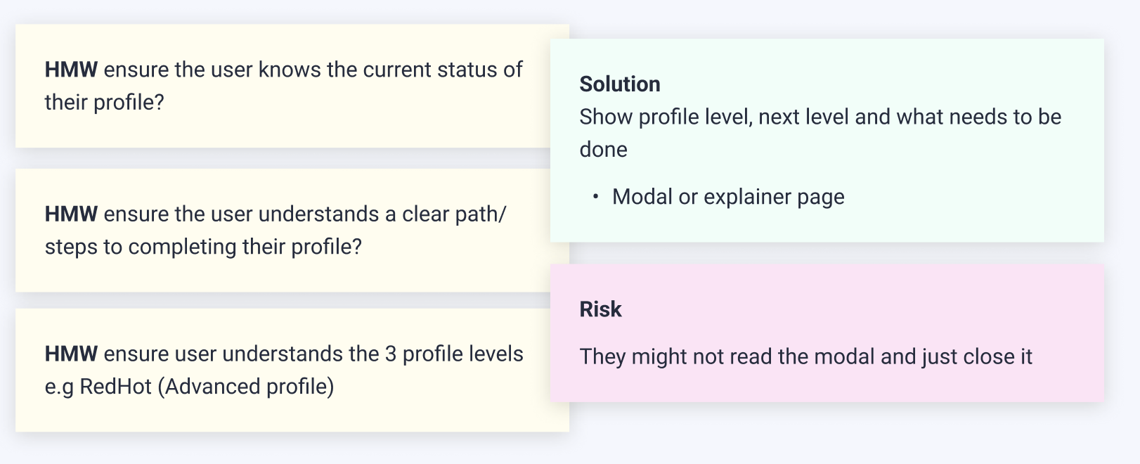
• HMW ensure the user knows the current status of their profile?
• HMW ensure the user understands a clear path/steps to completing their profile?
• HMW ensure user understands the 3 profile levels e.g RedHot (Advanced profile).
Risks
• They might not read the modal and just close it
Solution
Show profile level, next level and what needs to be done
• Modal or explainer page
Prototype
Current profile screen
Write something about the user current screen here with some wireframe if that is what you've decided to go for.

Wireframes


Usability Tests
The objective of the test is to ensure the user understands a clear path/steps to complete their profile. This is also to reduce time spent on average completing their profile
Method and participants We opted for unmoderated user testing sessions using usertesting.com, targeting participants aged between 18 and 25 years old.
Method used
Prototype testing
We then used the feedback and iterated the designs
Final Design
")
Insight and top takeaway
Carousel
4 of 5 understood the 'Build profile' carousel immediately.
Quotes: "The Big blue button is difficult to miss"
Empty state
4.5 of 5 candidates understood the empty state as sections that needs to be filled in to build their profile. One candidate thinks of it as a "quick way" of building their profile. The helper text in the empty state also helped a lot.
Quotes: "The first 3 sections are clearly complete"
Checklist (side panel)
All 5 understood it. This was very clear to the candidates and they understood what have been completed and what they are yet to do.
Quotes: "It's pretty clear what you have to do"... "They tick it off for you"
Confirmation (Modal)
Some candidate did not understand what Phone screening means.
Quotes: "I Don't like the wording at all", "Hopefully get more details on what phone screen means when I
click on the button"
Overall, candidates find the sections quite clear and easy to understand their current state and what they need to do next.
Impact/Results
A redesigned profile is driving higher & faster rates of completion.
20% more candidates convert and 30% more do so in under 24 hours.
Here is a screenshot of the live chat on zoom while we presenting the new profile building screen at the company all-hands.

